STEVE LAMBE INTERVIEW
CHARACTER DESIGNER FOR ANIMATION
Sunday, November 06, 2005
BROUGHT TO YOU BY THE CHARACTER DESIGN BLOGSPOT
IF YOU WOULD LIKE TO SEE MORE CHARACTER DESIGNERS GO TO THE HOME PAGE BY CLICKING HERE
THE INTERVIEW
Tell me a little bit about yourself, about your life?
I was born in Newfoundland, Canada. Both my parents were teachers in my hometown. My mother taught grade 2, and my dad taught a lot of the high school courses. One of those happened to be art. It's kind of funny thinking back now, but when I was in high school I wanted to be in his art class, but he wouldn’t allow it. He wanted me to take something useful like French instead. He was very supportive of my drawing, but I don’t think he saw it as much of career.
Where did you go to school, and what classes did you study?
After high school, I decided I wanted to follow in the family tradition and become a teacher. I was about three years into college when I heard from a friend about the animation program that had just started up in Miramichi, New Brunswick. I wasn’t really enjoying the university environment all that much, so I applied for the program. I must have been pretty awful because I was initially rejected. It was recommended that I do the art fundamentals program first, and if that went well, then they would grant me access to the program. Long story short, I squeaked by and got into the program.
What helped prepare you to become the artist that you are today?
Great question! I guess it's a combination of factors really. Working with talented artists has to be number 01. I've been very fortunate in that I've been surrounded by some really great people, and I've learned a ton. I think that's essential to an artist growth. Working alone is ok, but you definitely don’t get that exposure to a lot of different theories, tips, and influences you get in working with other artists.
Number 02 would have to be the internet. A few years back, I discovered a forum started by the amazing Shane Glines, called the Drawing board (now called Drawingboard.org). My brain almost exploded! Here was a community of super talented artists that were sharing their art on a daily basis. More importantly, it wasn’t exclusive to professionals. Anyone could post, and get feedback. It's a very welcoming community and I was instantly hooked. By posting my own art, I was able to get feedback from professionals that I would never have had the opportunity to meet otherwise. Through a process of trial and error, I soon found out what worked and didn’t work. It's been an amazing ride over the last 4-5 years. I’ve made many friends...and again...learned a ton.
I guess number 03 would have to be television. Through emulating what I saw on TV, I learned how to draw in those styles. Sometimes, too much so. I remember getting an email from an art director at Budweiser one time who said I knew how to do ape a lot of different styles, but when was I going to get my own. It bothered the hell out of me at the time, but I think it helped me grow a little more. I think I've finally gotten to a place where I have my own recognizable style. At least I hope so. It’s still something I struggle with.
How do you go about designing a character, and what goes through your mind, from start to end?
Hmmm. I guess there are four things I like to focus on. Personality, shape, expression, and posing. The key to character design is personality...the last three are just icing on the cake. Right now I'm sure a lot of the people reading this are saying...."well…duh!" Seriously though this is only something I'm recently discovering myself. Up until this past month, I tended to focus solely on the surface qualities of the character. Does he have a cool shape? Is her expression funny? Is that a funny run pose? All meaningless if it doesn’t match the personality of the character. My new mantra (thanks to the advice of Stef Choi) is “Draw things that are unique to that character only”. That said...I do love playing with style choices. So much so, that I often sacrifice form, for style. It's a fine line and I hope to find that balance one day.
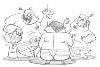
Once I have a firm idea for a character in mind, I start doodling loads of small thumbnails. About 8-10 per page, I guess. It's important to stay loose at this stage and just go balls out with lots of fun & interesting shape variations. Once I get a decent amount of these, I select the most interesting, scan them up, place about three sketches per page, and print it out. Three is good number because then you get a good feel for how shapes and proportions are working together, plus it helps keep you from repetition in design. I use this approach in doing lineups as well.
From there, I slap down a fresh sheet of paper, and start refining the sketch...focusing primarily on posing adjustments and expression. This is where you start focusing on one of the most important principles of good design…CONTRAST! My thanks to Shane Glines, and Luke Cormican for teaching me this one. It's a very powerful theory. It includes subjects like curves vs. straights, asymmetry vs. symmetry, simple vs. complex, small vs. big, thick vs. thin, etc. Contrast adds interest and appeal to a character.
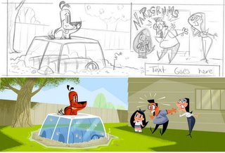
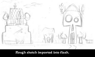
Once I get the design nailed down, I scan in the designs and bring them into flash to do the final line work and color. I'd like to add that even at this stage, the design is still open to changes. I'm not one of those gifted artists that can nail a design in one sketch. Everything I do goes through multiple stages of experimentation and adjustment. Some would say it kills all spontaneity in the pencils, but I feel it works ok for me. Maybe one day I'll be talented enough to nail it first try, but for now I enjoy the struggle.
What do you think really helps you out in designing a character?
Thinking simple. Reduce everything to its simplest form. You can easily kill a design with over complication. I think that’s why I don’t enjoy a lot of comic art anymore. All that cross hatching, and muscle rendering. You can do a lot more with a lot less. I heard the coolest little quote from Bill Wray the other day. Whenever you're done with an illustration, go back and figure out what you didn’t need. Thanks for that little nugget of knowledge, Bill!
From your own experience and maybe from some people that you know, what should we put in our portfolio and what should we not?
That’s a tough one. I’d have to say include lots of variety. People, and animals. Color and sketches. Rotations and multiple character poses. Not so sure about life drawing. I think it’s incredibly important for an artist to have that knowledge, but not to put it in your portfolio. I think it’s much more important for a character designer to showcase their ability to caricature life rather than copy it.
Outside of that, I’d say make sure your first image be one of the best in your whole portfolio. Reviewers go through hundreds of portfolios, and they don’t have the time to look through everything. Grab their attention with that first image. Oh and if possible, use a transparent cover. It’ll make it even easier to see your artwork.
What are some of the things that you have worked on?
I started out at Trainingscape studios Canada (now Fatkat Animation and Copernicus). We created 2d flash animated educational content for corporate America. Really boring subject matter, but every project was done in a different style, so it a lot of fun from a conceptional art standpoint. Man…we had a talented crew of people! Unfortunately due to funding problems, the company folded. C’est la vie!
After that I landed a job as a character designer/storyboard artist at Trapeze Animation, on a show called Doodlez. That was a super fun show, and my first taste at being a full time designer. As with most animated shows, the work dried up after season 2.Through one of my old Trainingscape pals, I applied for work with a game company in Chicago.
Working in Chicago has been great. I have the stability of a 9-5 job, and my night and weekends are free to do freelance. I’ve had a lot of exciting jobs over the last two years. I’ve done development work on a new show for Spike TV. I’ve got a regular monthly page in Disney Adventures magazine, and most recently I was hired to do character design for Cartoon Network’s show, “Hi Hi Puffy Ami Yumi”. I’ve always wanted to work for Renegade Animation Studios, so this was a really big deal for me.
Is there a character design you have done that you are most proud of?
I guess that would have to be “Twiki and Blip”.
http://www.stevelambe.com/Blip/web/index.html
It was a short story I did for the folks over at Zowie Comics. It was great experience because I got to not only flex my artistic muscles in terms of design, but also in story. I can really understand how thrilling it is to do your own story. I’m hoping to take what I’ve got so far, flesh it out to 30 pages, and do it as a children’s storybook. I’m a huge fan of the 50’s golden books, so doing something along those lines would be amazing.
What are you working on now? (If you can tell us)
That’d be Hi Hi Puffy Ami Yumi, and a kid’s book called “Bubba, the big mouthed Bass” for Immedium. Oh and the monthly “Last laughs” page for Disney Adventures. Who needs sleep!
Where is the place you would like to work if you had a choice?
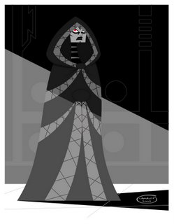
I don’t really think about where, but for whom. At Cartoon Network, I would love to work for one of two people…either Genndy Tartatkovsky, or Craig McCrakken. Both of these guys are animation giants in my book. Samurai Jack and Powerpuff girls have been huge influences on me. I’d sign up for anything these guys did.
Next would have to be Rob Renzetti at Nickelodeon.“My Life as a Teenage Robot” was an incredible show. Some of the best art design I’ve seen. I was very sad to hear the show got cancelled.
Working for John K, at Spumco would have to be a close third. He just seems to bring the best out in his artists. I hear he’s a tough teacher, but if you can survive you’ll become a better artist for it.
Then there’s Chris Savino over at Warner Bros. He took two firmly established properties (Dexter’s Lab and Powerpuff Girls) and just took it to a whole new place. Improved upon them big time. That’s no easy feat! He’s got this great new show now called “Johnny Test” that has some great designs. He’d be a great guy to work for as well.
I know a lot of people say they’d like to be at Pixar…and yes that would be a fantastic place to work. Unfortunately, I’m not much of an animator, and not a lover of 3d…so I guess I’m out of luck. BUT if Pixar was to ever do a 2d feature in the flat concept art style they have in many of their “art of” books….sign me up!!
Who do you think are the top character designers out there?
How much time ya got? Ha! I know a lot of people go low key and say “Too many to mention.”, but I cant do that. I have a lot of influences and I have to give credit where’s it’s due. Without the spark of inspiration these people have given me, I wouldn’t be anything.
My top two would have to be Shane Glines and Craig Kellman. These guys are like design gods to me. Shane is the master of appealing design….especially with women. Not only that but he’s been very good to me in terms of offering advice and being supportive. Craig is a cartooning genius. I don’t think he’s capable of a bad design. Working with him would dream come true.
Outside of those guys is a long list.
New school:
Lynn Naylor, Chris Reccardi, Alex Kirwan, Stef Choi, Shakeh Haghnazarian, Jill Friemark, Gabe Swarr, Katie Rice, Jorge Gutierrez, Ovi Nelecu, Mark Ackland, Todd Kauffman, Jose Luis Agreda, Fabrice Parme, Ahmed Guerrouache, Alex Boudon, Jasen Strong, Brianne Drouhard, Stephen Silver, Ben Balistreri, Patrick Morgan, John Nevarez, Jared Deal, Paige Pooler, Sandra Equiha and Sean “Cheeks” Galloway.
Old school:
Mary Blair, Tom Oreb, Ward Kimball, Ed Benedict, Hank Ketcham. Chuck Jones, Mel Crawford, and Al Hirshfeld.
Untapped talent:
Jon MacNally: http://www.jonmcnally.net/
Josh Parpan : www.rparpan.blogspot.com/
Denis Goulet: web: www.denis-goulet.com/
blog: http://drawingboard.org/blogs/Denis/
Joel Trussell:web: www.joeltrussell.com
blog: http://joeltrussell.blogspot.com/
Robin Mitchell: www.robinmitchell.ca/
Javier Guzman: www.javier-guzman.blogspot.com/
Bob Rissetto: www.bobrissetto.blogspot.com/
Heath McPherson: www.autumncountry.com/
and my personal fave,
Jeremiah Alcorn:
www.alcornstudios.com/ and www.alcornstudios.blogspot.com
Someone exploit these guy’s talents please!
How do you go about coloring the character, what type of tools or media do you use?
I get a lot of questions about this. Almost exclusively flash and Photoshop. Although I’ve been dabbling in Painter recently. I do all my line work and flat colors in flash, export a high rez jpeg,…import it into Photoshop and paint all the shadows and texture in there. I dub it the “tradigital” medium. Yuk yuk yuk! Blah!
At one time I used to enjoy that ultra clean crisp vector look of flash. I think I was mostly attracted to flash’s ability to create nice line work. If you’re like me and have shakier hands than a crack addict, then flash is the way to go. The brush and a wacom are the perfect solution. You can get some great thick and thins.
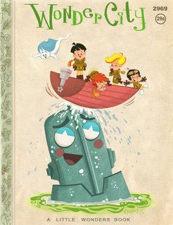
Since discovering the golden books of the 50’s though, my art’s changed dramatically. I’ve got a major hard on for the works of Mel Crawford, Mary Blair, the Provensons, and J.P. Miller. Ironically, this newfound passion happened to coincide with Adobe releasing version 7 of Photoshop, which had this fantastic library of brushes that simulated real media paints. Not perfect of course…but close. Initially I used just those default brushes (especially the dry chalk), but I’ve slowly started building a library of my own custom brushes...like dry brushes, sponges, and spatters. The only time I use real paint is when I need to simulate an acrylic effect. I’ll paint in black, scan it in and turn it into a brush. Photoshop is great like that.
Another reason I use Photoshop is that it introduces the warm quality back into the art. Flash and illustrator art have this cold sterile feel to me. When you start painting on top, it adds the human quality back again. There’s just something in all those little mistakes are important. It adds the organic human element.
What type of things do you love to draw, and why?
I love to draw people I know. If you ever want to get some good character design practice, then try doing a lineup of your friends in different styles. Since you’re so familiar with their faces and attitudes, the work seems to flow a little easier. Just be careful…some of your friends will probably be a tad sensitive about being turn into a monkey with a big shiny butt.
What part of designing a character is most fun and easy, and what is most hard?
I’d have to say faces and hands are the most fun. Since those are the most expressive parts, that where you need to spend the most time. Hmm…what’s easy? Well...building up a mental library of design shortcuts is very easy...like swirly ear innards, square fingers, and U shaped eyes. The hard part is avoiding those shortcuts. If you don’t, you’ll get into a rut and you won’t grow as an artist.
I have a ton other areas that I have difficulty with. Originality being the biggest hurdle. Then there’s posing and expressions. It’s a struggle, but that’s part of being an artist right?
What are some of your favorite character designs and least favorite, which you have seen?
Some of my favorite new character designs were for Samurai Jack. That really opened a door for me. The art direction on the show was just incredible and was a real breath of fresh air when it came to story.
The art direction on “My life as a Teenage Robot” is another. Alex Kirwan and Rob Renezetti really went all out on this show. They merged the retro art of the Fleishers with the design sense of Osamu Tezuka. Plus it’s packed with cool robots!!
The Disney short “Toot ,Whistle, Plunk, Boom” is yet another source of inspiration for me. It’s brilliant in its design…due entirely to the efforts of Tom Oreb and Ward Kimball. In fact it’s sort of the source for a lot of design styles today. I can see a lot of today’s artists pulling inspiration from that one. Including myself.
My least favorite designs would be almost everything on Adult Swim…with the exception of the Venture Brothers. I don’t understand how some those other shows get made. I understand that the writing is funny, but the design and animation? Yikes!!
What is your most favorite subject to draw?
Besides friends? Another tough one. It used to be women, but that got kind of boring after awhile. Not saying that I was good at it...it just got boring. I guess one my new favorite things to draw is backgrounds. When I first started in Chicago, I met a gifted background artist by the name of Bruno Werneck. Whenever I showed him my work, he would hammer me on why I didn’t do any backgrounds. And you know what? He was right! A lot of time it would be just a pose of a character on a plain white background. Why limit your design tastes to just character. It’s only one side of the coin. It’s slowly something I’m beginning to study and enjoy.
What inspired you to become a Character Designer?
I guess working at Trainingscape. At the beginning of each new project, we did this great thing where every artist in the studio got to do concepts for a week. On Friday, we would round up all the art, post it up on a board, and sort through the lot for the strongest designs. My stuff wasn’t picked all that often, so it spurned me on to improve my design skills.
Another thing would have to be Samurai Jack. The look and feel of that show really opened up a whole new world for me. In my spare time, I would pretend I was doing designs for the show. It was a great training ground, and a positive learning experience.
What are some of the neat things you have learned from other artists that you have worked with or seen?
Well…as you can see by most of my interview, I’ve already mentioned a lot of people that have contributed to my education as a designer. Without exposure to such a realm of talented artists, I wouldn’t be much of a designer. The key now is to take that foundation and build on it. Make some really unique.
What wisdom could you give us, about being a character designer? Do you have any tips you could give?
Beware of ego. The minute you start believing that you’re better than everyone else, you stop learning. That’s not to say you shouldn’t have confidence in your work…just that there’s always room for improvement. Always be open to new ideas and keep evolving as an artist. Solid artistic advice can come from amateurs just as much as it does professionals, and no matter how good you are, there’s always someone better!
Draw, draw, DRAW. I didn’t believe in this one at all until a few years ago. I only drew at work, and that was a mistake. If you treat it as a job, and not as a joy….you’re not going to improve. I see that in a lot of people. They regard drawing as strictly a 9-5 thing, and their drawing abilities begin to level off…even recede. If you aren’t getting enough of what you’re drawing at work or school…then unload that fun stuff for your sketchbook at home. Work those frustrations out on paper. At least at the end of the night, you’ll feel some level of satisfaction and you’ll have some great drawings for the portfolio.
Get a website. Having an online version of your portfolio is critical these days. Not only does it save you the cost of making hundreds of color prints, but it’s also open 24/7 for potential employers/clients to look at. If you can’t afford to get web space, get a free blog.
The internet is the best promotional tool an artist can have. Get out on the forums, post your art, email your favorite artists, and build relationships with artists like yourself. The animation industry is a lot smaller than you think. Every contact you make is invaluable.
Be open to criticism. This sort of ties into my earlier advice about ego. If you’re a closed book to advice then you aren’t learning. Be very honest with yourself about what your strengths and weaknesses are. Build on those positives, but work twice as hard on your weaknesses. Be your own worst critic. It’ll make you a better artist.
If people would like to contact you, how would you like to be contacted?
I’m always open to emails!
Email:steve@stevelambe.com.
Website: www.stevelambe.com
Blog: www.lambey.blogspot.com
Finally, do you have any of your artwork for sale (sketchbook, prints, or anything) for people that like your work can know where and when to buy it?
I’ve got a few things up for sale right now actually. Both copies of my “Samiches” sketchbook are available in the shop section of my website:
http://www.stevelambe.com/shop/Shop.html
Anyone interested in picking “Twiki and Blip” can go to Zowie Comics, and pick up Vol.02. The book showcases the work of a large group of talented artists, and is well worth picking up.
http://www.zowiecomics.com/
Guess that’s about it. Hope everyone enjoyed my scattered thoughts, and many thanks to Randall for creating such a valuable resource for character designers worldwide. Looking forward to what’s to come!!
CLICK HERE TO GO BACK TO THE CHARACTER DESIGN HOMEPAGE
Subscribe to:
Comments (Atom)


